This project involved developing a holistic brand mark for Agrichexers Corporation's new animal feed line, Chexer Feeds. The core deliverable was a distinctive, scalable logo designed for versatile application across digital platforms, print collateral, and on product packaging.
Context
Agrichexers Corporation needed to launch a new, dedicated animal feed brand that could instantly communicate its dual focus on poultry and swine nutrition to a diverse agricultural client base. The existing corporate identity lacked the necessary approachability and specific segment relevance, creating a barrier to market penetration. The key problem was the need for a single, memorable visual identity that could simultaneously represent both a chicken and a pig while signifying quality and integration.
Date Completed:
Apr 2016
Role:
Graphic Designer
Involvement:
Logo Design, Product Mockup
Overview
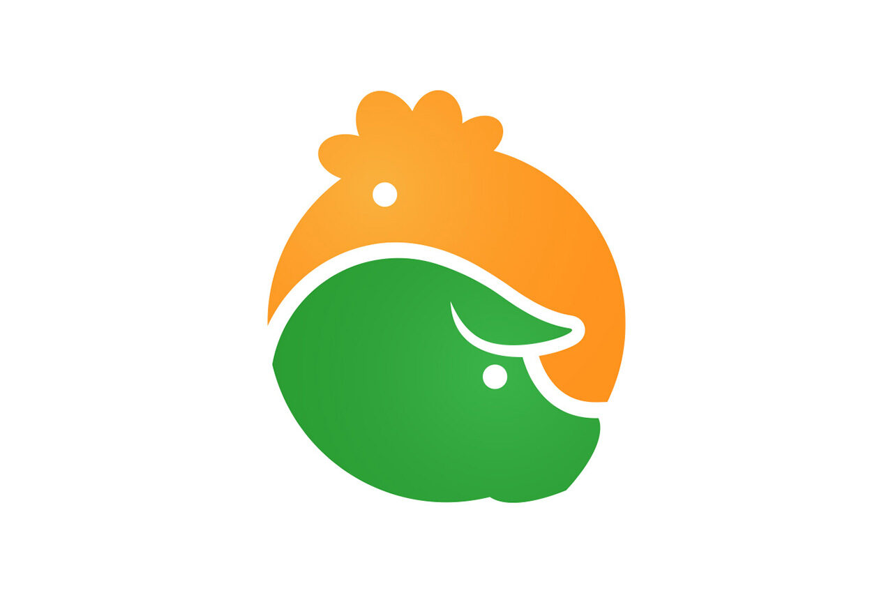
My strategic approach was to move beyond conventional, literal depictions of livestock and create a symbiotic mark using negative and positive space. The plan focused on designing a circular, interconnected icon—a visual metaphor for balanced nutrition—that would be immediately recognizable and effective even in low-fidelity applications, such as printing on burlap sacks. This would ensure high brand recognition at the point of purchase.
Challenge
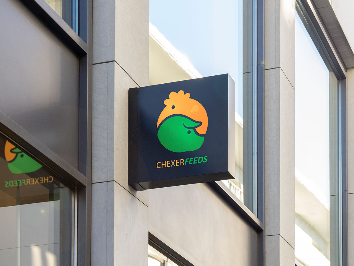
The primary design challenge was the combination of two distinct animal profiles (chicken and pig) into a clean, modern, single-color-safe, circular emblem without appearing cluttered or abstract. Furthermore, the design had to maintain its legibility and brand impact across extreme scales, from a small website favicon to a large exterior storefront sign.
Solution
I employed a minimalist, geometric design language. The logo utilizes a perfect circle, horizontally divided by white space that ingeniously forms the nose/snout of the pig in the lower section and the head/comb of the chicken in the upper section. The use of a simple color palette—a vibrant green (suggesting health and nature) and a warm orange/yellow (representing energy and poultry)—was chosen for high contrast and strong emotional recall. By creating a single, integrated shape, the design achieved the required duality and maximized visual simplicity for effective, cost-efficient reproduction on varied surfaces like the final burlap packaging.
Results
The successful implementation of the iconic, dual-animal logo led to a significant improvement in brand communication and market recognition. Post-launch surveys among the target demographic indicated an increased logo recall by 18% within the first quarter, substantially improving on previous internal benchmarks. The visually integrated design was also credited with reducing packaging printing costs by an estimated 10% due to its two-color, high-impact simplicity, directly translating the creative design solution into a tangible business efficiency.
Let's work together
Let's work together
Let's work together
Let's work together
Let's work together
Let's work together
Let's work together
Let's work together
Let's work together
Let's work together
Let's work together
Let's work together
Let's work together
Let's work together
Let's work together
Let's work together
Let's work together
Let's work together
Let's work together
Let's work together
Let's work together
Let's work together
Let's work together
Let's work together
Let's work together
Got something in mind?
Let’s build something remarkable together. Drop me a message and let’s chat.