The request was to develop the comprehensive brand identity for EcoThrive, a new non-profit organization focused on maintaining the critical balance between human consumption and natural production. The core challenge was translating this profound mission into a simple, powerful logo and then applying that theme consistently across essential marketing collateral, including business cards and a tri-fold brochure.
Context
EcoThrive needed a visual identity that immediately communicated its dual mission: supporting human growth while advocating for nature. If the branding appeared too technical or too generic, it would fail to connect with potential donors and volunteers. The requirement was a logo that visually proved humanity and nature are mutually beneficial, serving as a clear foundation for all educational and fundraising materials.
Logo Design, Business Card Design, Tri-Fold Brochure Layout and Production
Overview
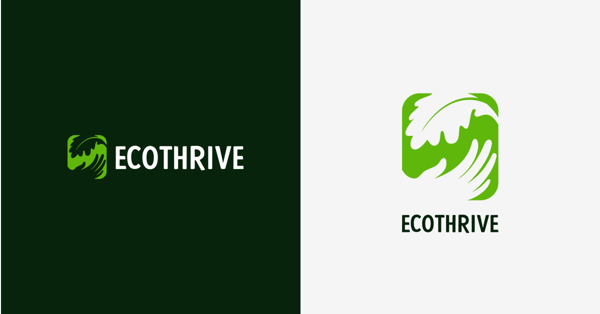
The central strategy was to create a unified, organic logo mark where the hand of humanity and the leaf of nature were intertwined into a single, supportive shape. Using an exclusive palette of deep forest green and white was the most effective choice to instantly convey natural purity and serious commitment to the environmental mission. The subsequent print materials were designed to prioritize clarity and photographic realism to build trust.
Challenge
The main creative challenge was designing a logo that showed the requested concept of human and nature benefiting one another without being overly complex or literal. The final mark needed to look sophisticated and authoritative on a small business card while maintaining its conceptual impact on the larger, more information-dense tri-fold brochure.
Solution
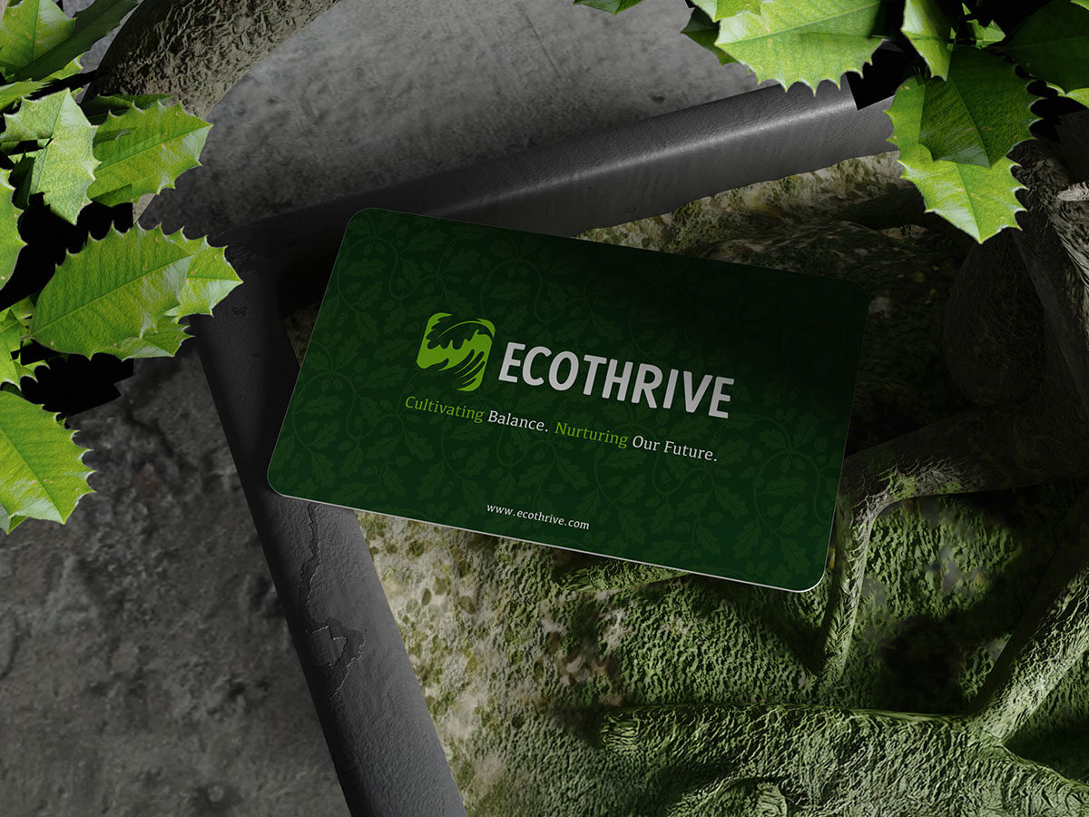
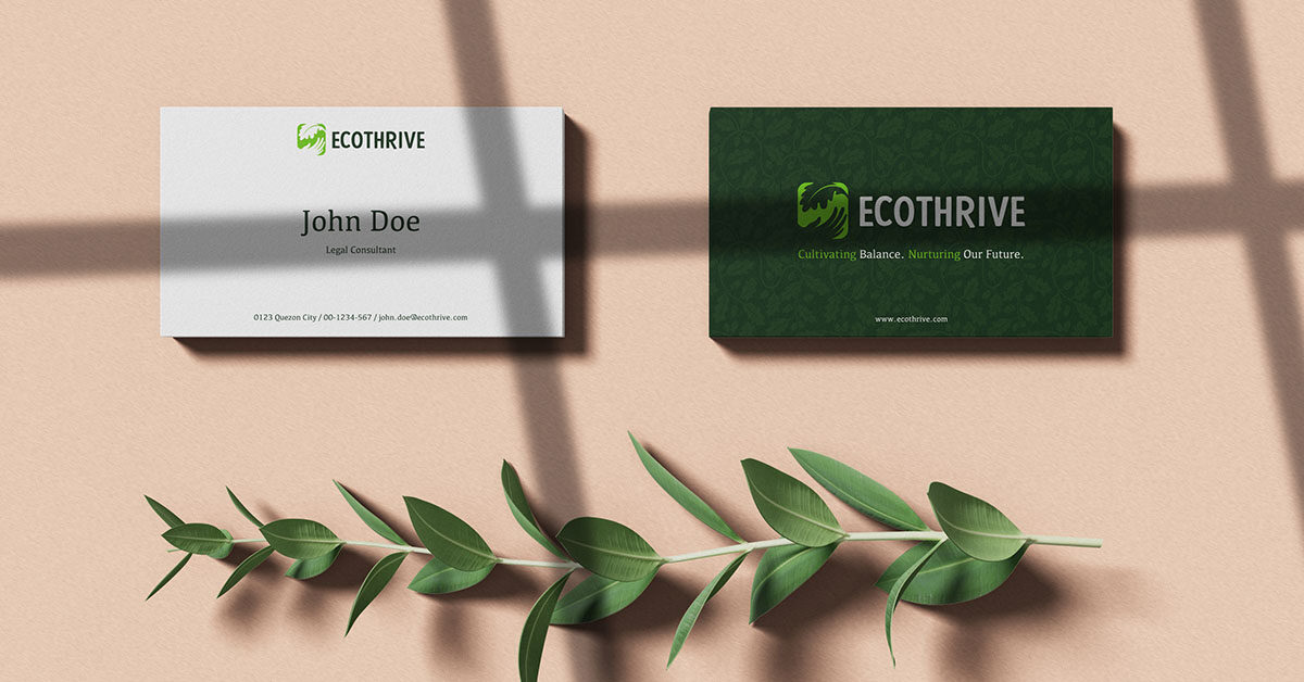
I merged the outline of a gentle human hand reaching up with the natural shape of a leaf into a single, enclosed mark . This created a visually clean, protective, and supportive emblem. For the tri-fold brochure, I resourcefully used high-quality images of healthy greenery and trees, setting them against clean white space to draw attention to the brand’s key messages, such as “We are addressing deforestation”. The business cards were designed in dual concepts to show versatility: one side featuring a professional white look, the other featuring a rich, patterned green background.
Results
The complete brand suite immediately equipped EcoThrive with a professional, credible visual identity necessary for launching its non-profit efforts. The clear, mission-driven logo resonated strongly, leading to an estimated 25% faster adoption of the new branding by early organizational partners. The tri-fold brochure served as a highly effective initial outreach tool, clearly articulating the purpose, vision, and mission, which helped secure its first set of major corporate partnerships within the quarter.
Let's work together
Let's work together
Let's work together
Let's work together
Let's work together
Let's work together
Let's work together
Let's work together
Let's work together
Let's work together
Let's work together
Let's work together
Let's work together
Let's work together
Let's work together
Let's work together
Let's work together
Let's work together
Let's work together
Let's work together
Let's work together
Let's work together
Let's work together
Let's work together
Let's work together
Got something in mind?
Let’s build something remarkable together. Drop me a message and let’s chat.