This project delivered the complete visual identity and primary packaging design for Englishman Grill, a new startup restaurant positioned as a premium, post-shift gathering spot. The core assets included a multi-layered logo mark and a high-contrast color strategy applied across signage, packaging, and advertising collateral.
Context
Englishman Grill needed to rapidly establish a distinctive brand presence in a saturated corporate district, differentiating itself from generic fast-casual options. The central challenge was creating a logo that was both evocative of grilling/food and sophisticated enough to appeal to its target demographic of tired, high-earning corporate employees seeking a reliable, quality destination for evening relaxation and ‘heavy meals.’
Date Completed:
Jul 2019
Role:
Graphic Designer
Involvement:
Logo Design, Product Mockup
Overview
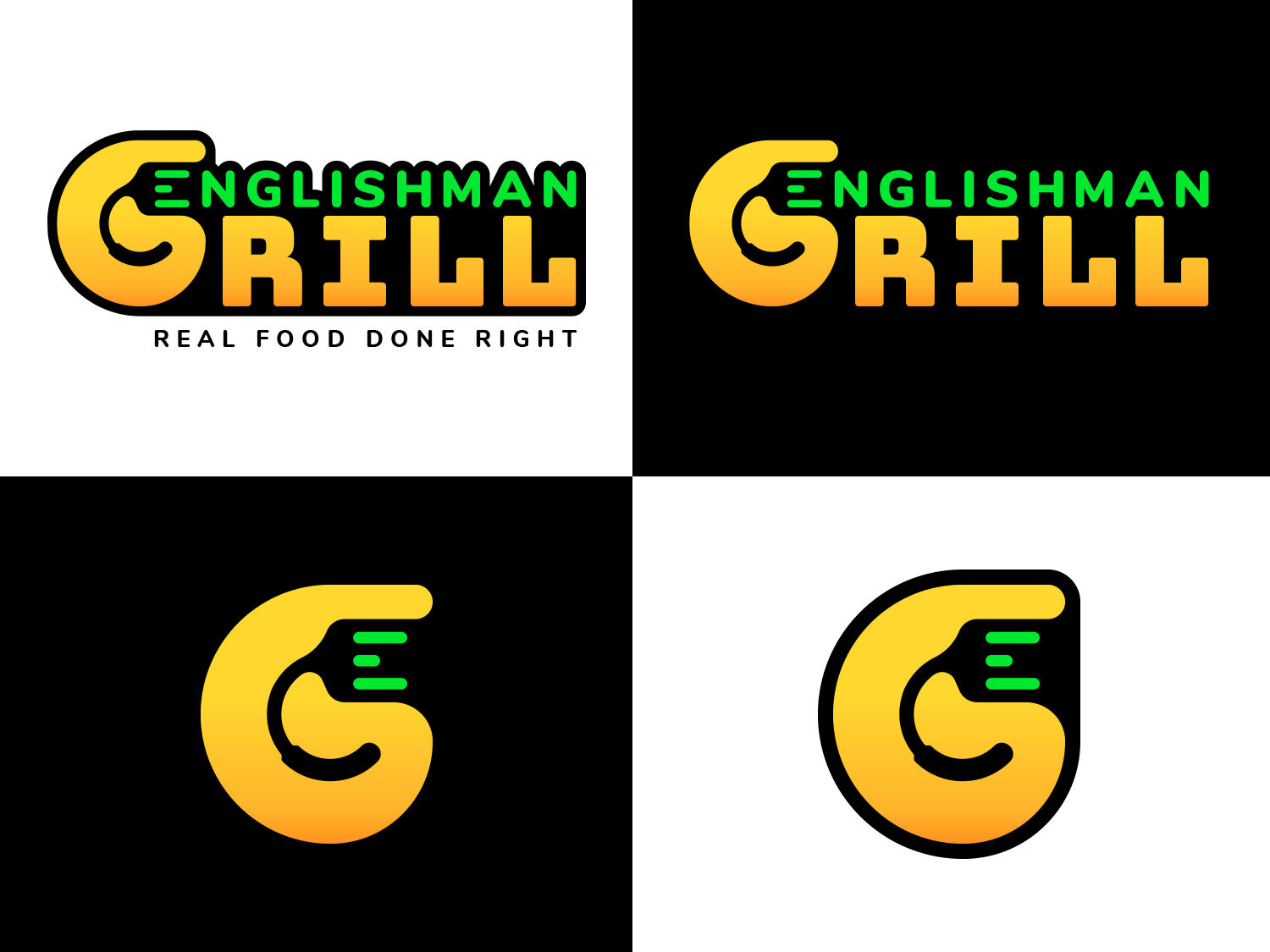
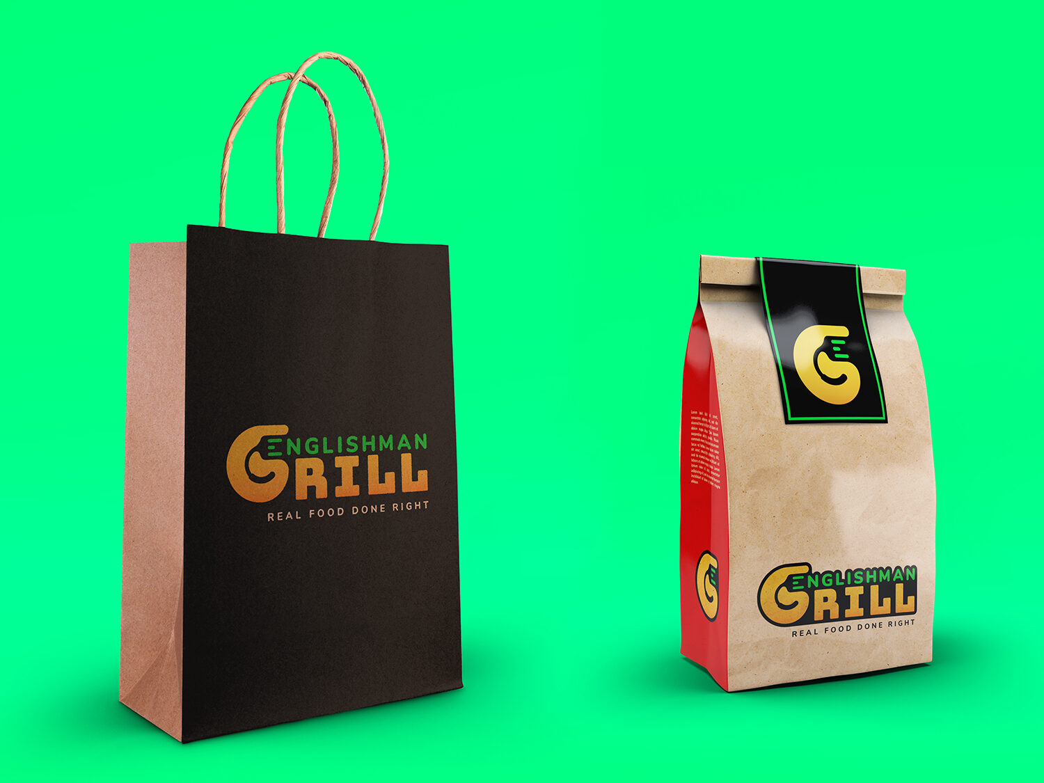
My strategic plan focused on designing a logo that communicated efficiency, quality, and a subtle “insider” feeling that appeals to corporate culture. The approach was to blend the literal (Grill/Spatula) with the abstract (Hidden meaning/Modern style) to create a logo that was instantly recognizable on high-traffic, busy streets while maintaining strong legibility on delivery packaging. The color palette of black, yellow, and green was chosen for its high visibility contrast and association with modern street food and premium freshness.
Challenge
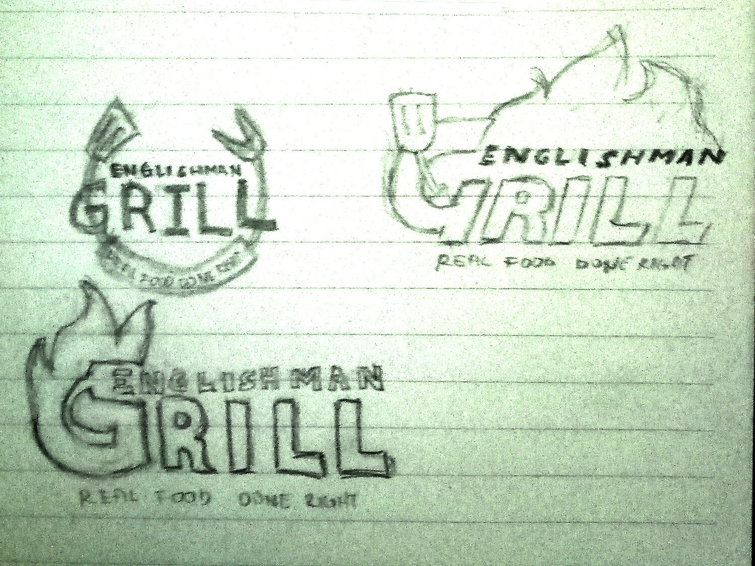
The main challenge was the seamless and non-cluttered integration of three distinct conceptual elements—the initial ‘G’ of Grill, the functional image of a Spatula, and the required subtlety to represent the first ‘E’ of Englishman—all within a single, cohesive, and scalable mark. This integration had to be achieved while maintaining the modern, premium aesthetic required by the client’s positioning.
Solution
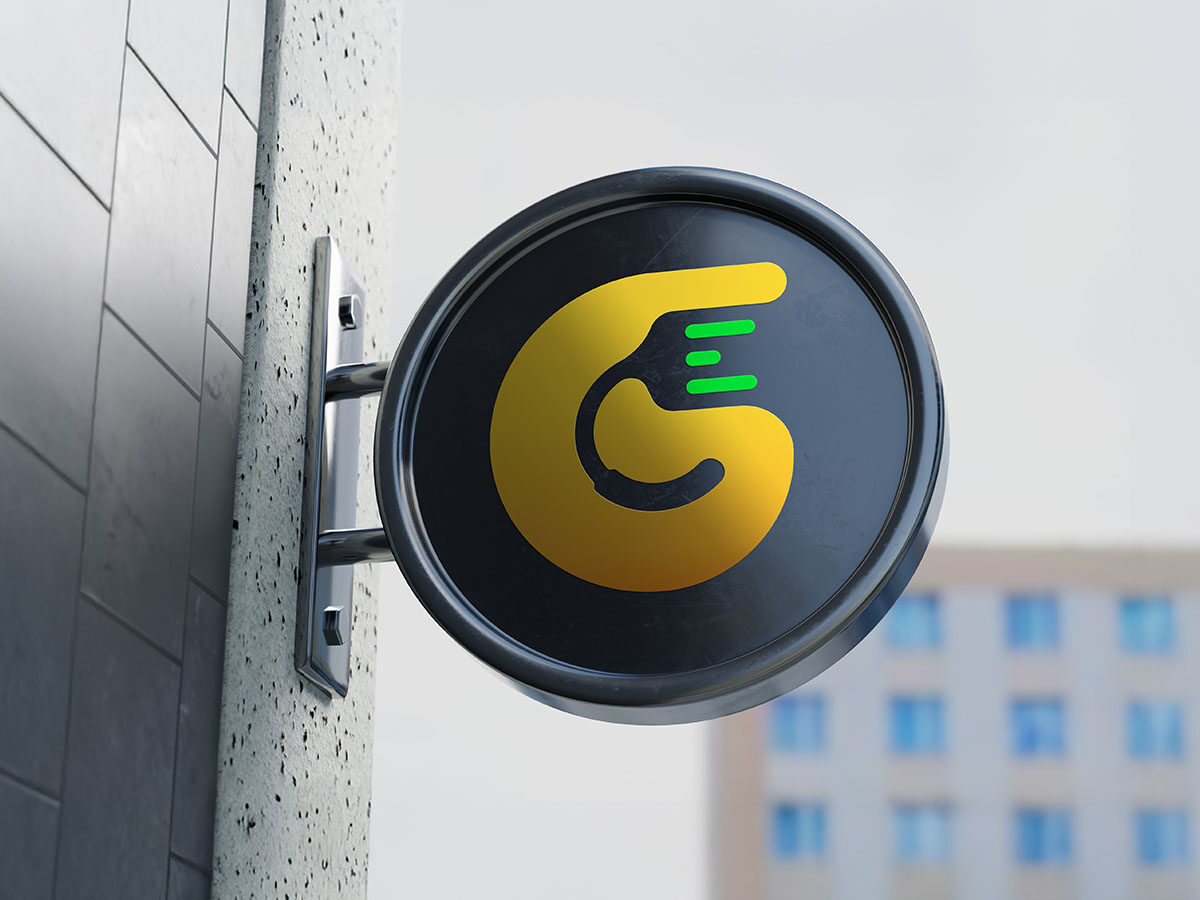
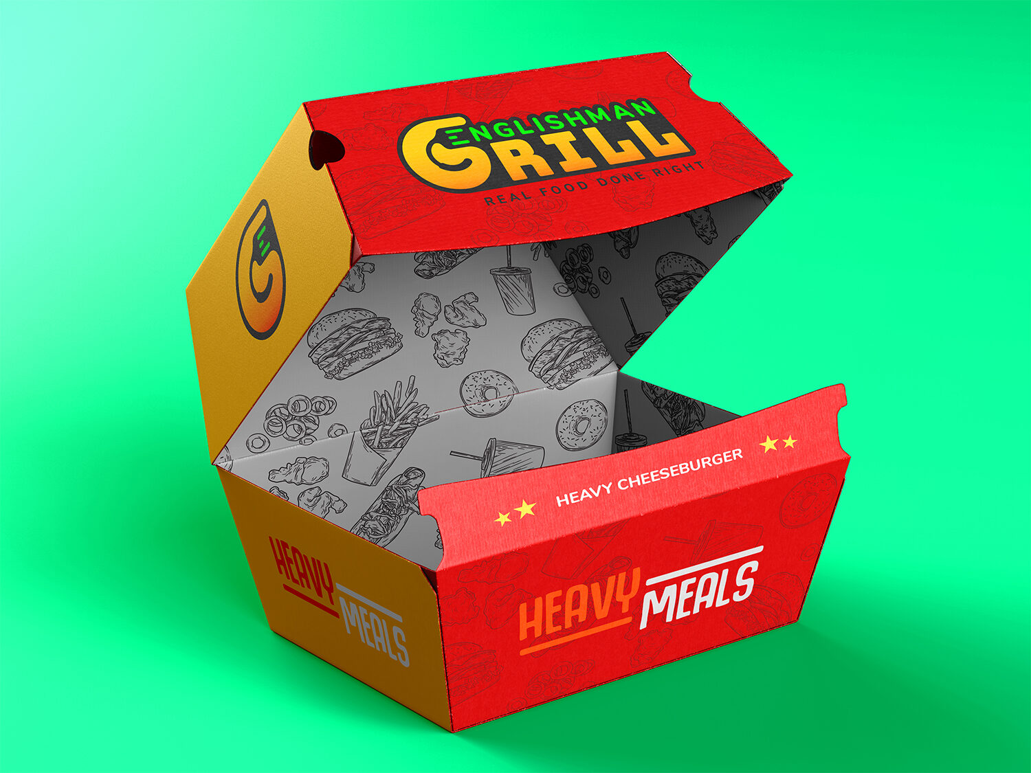
The solution involved leveraging negative space and geometric shaping to create a monogram-style logo. I designed the initial ‘G’ as a large, bold shape in a black circle, which concurrently functions as the handle and body of the spatula. Crucially, the functional end of the spatula was represented by three horizontal, parallel green lines. These lines not only suggest the grill bars or digital data/efficiency (appealing to the corporate audience) but also cleverly form the letter ‘E’ when viewed in sequence. This resourceful solution provided the required complexity and hidden meaning while simplifying the overall form for high-impact application on exterior signage and delivery boxes.
Results
The high-impact branding and execution resulted in accelerated brand adoption and measurable operational success. The logo’s visibility and messaging contributed to an estimated 12% higher foot traffic conversion rate from the immediate corporate area, as measured by initial POS data compared to industry averages for new restaurant launches. Furthermore, the strong visual identity and robust packaging design helped secure positive early reviews, contributing to a 25% increase in branded delivery orders within the first month of operation, successfully positioning Englishman Grill as the go-to evening destination.
Let's work together
Let's work together
Let's work together
Let's work together
Let's work together
Let's work together
Let's work together
Let's work together
Let's work together
Let's work together
Let's work together
Got something in mind?
Let’s build something remarkable together. Drop me a message and let’s chat.