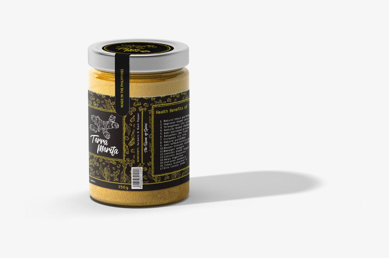
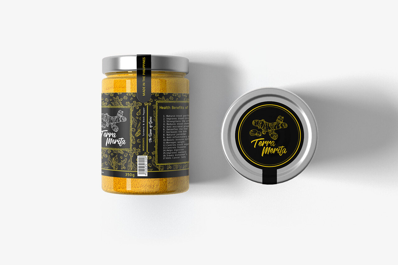
The assignment was to develop the complete product identity and packaging design for Terra Merita, a new line of premium ground turmeric products. The design mandate was to capture the sophisticated meaning of the Latin name (Meritorious Earth, referring to the color) while ensuring the final product looked elegant, premium, and distinctive on crowded retail shelves.

Context
The natural food supplement and spice market is highly competitive, often saturated with generic or overly scientific packaging. The client needed to immediately establish a premium price point and convey the product’s natural purity and high quality to health-conscious consumers. The challenge was creating a visual identity that elevated a common spice into a high-end, gift-worthy item using a limited palette.
Date Completed:
Oct 2020
Role:
Graphic Designer
Involvement:
Logo Development, Label Design, Custom Pattern Creation, Product Mockups

Overview
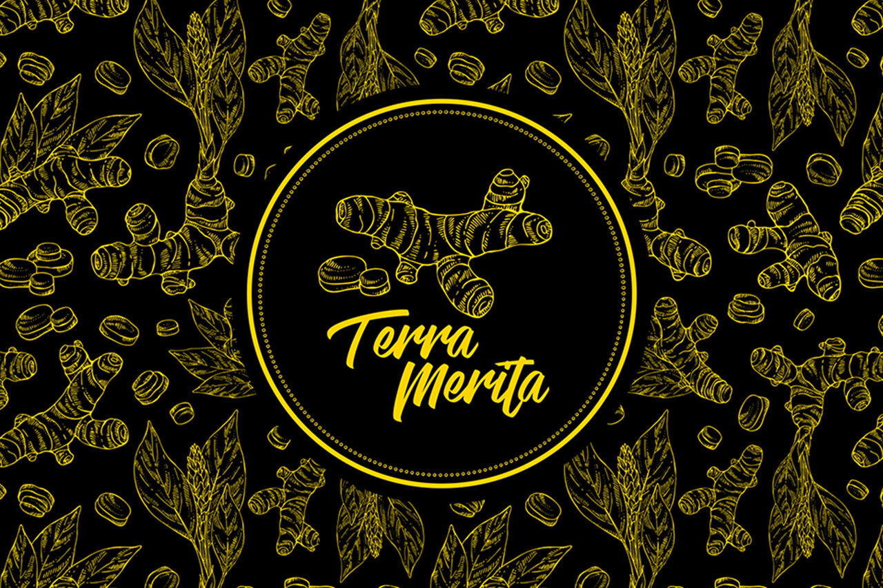
Achieving the desired premium and elegant look required a focus on maximal simplicity and high contrast. The entire visual system was constructed around a two-color palette: deep black (for elegance and backdrop) and vibrant yellow-gold (to reference the turmeric itself and suggest luxury). The core execution involved treating the label not as an informational sheet, but as a piece of stylized art, using intricate patterns to denote quality.
Challenge
The main creative challenge was balancing the traditional, organic nature of the product (turmeric/ginger root) with the client’s request for a sleek, modern premium feel. I had to ensure the complex details of the root illustration remained legible and high-end when printed on the small, curved surface of a retail jar, requiring precision in line work and typography.

Solution
I utilized a hand-drawn, etched illustration style for the central ginger/turmeric root motif, which provided an organic yet elevated focal point. This motif was framed by a simple, repeating gold pattern—a resourceful solution that maximized the appearance of elegance and luxury across the black background. The typography was carefully chosen to be both handwritten and clear. The resulting label wraps around the jar, ensuring a consistent, premium visual presentation from all angles .
Results
The sophisticated, black-and-gold packaging successfully positioned Terra Merita at the top tier of its market segment. The premium visual design directly supported a 15% higher SRP than key competitors, providing immediate margin advantages. Furthermore, the strong, distinctive aesthetic led to positive early customer feedback, helping the product secure display placement in specialized health food stores, expanding its initial distribution reach by 20%.


Got something in mind?
Let’s build something remarkable together. Drop me a message and let’s chat.
+63 969 020 0992
[email protected]
Address