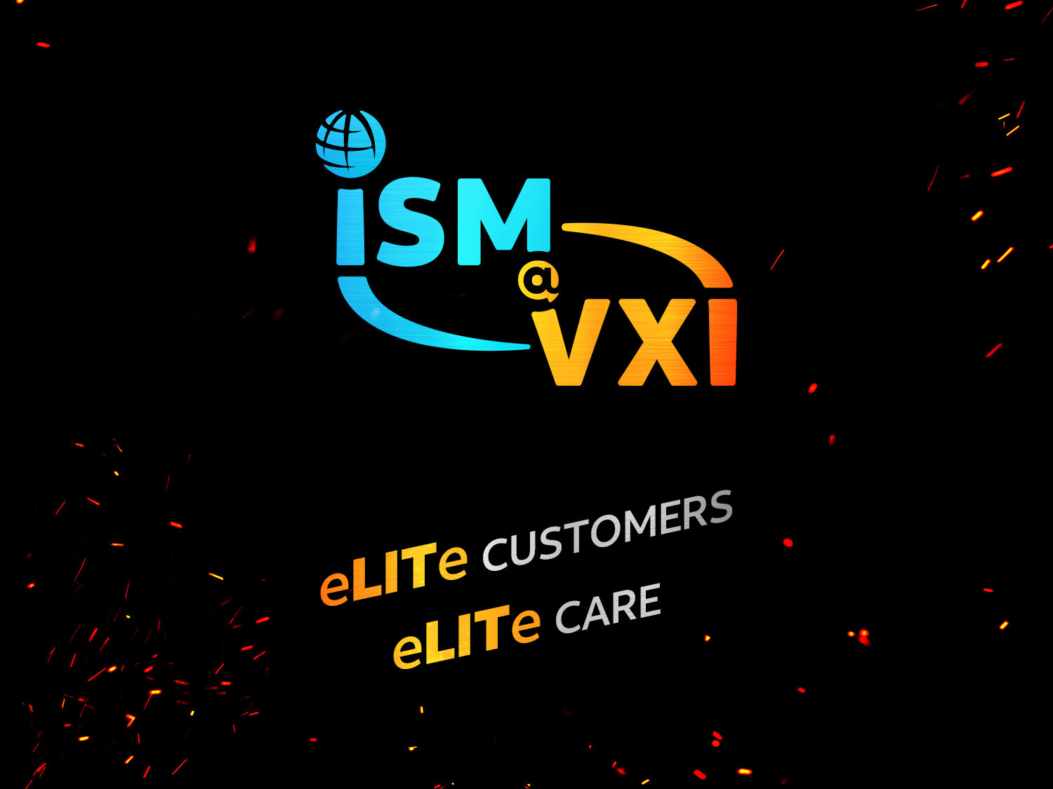
This engagement involved designing the complete visual identity for the internal ISM@VXI campaign, a crucial initiative aimed at unifying the teams of a major service provider and its high-profile client. The deliverables included a versatile logo mark and visual system optimized for both high-resolution digital deployment and large-format printing.

Context
The key challenge was to create a single, cohesive identity that emotionally and visually communicated the strong, interconnected nature of the strategic business partnership between the two distinct organizations. This identity needed to be versatile enough to serve as the unifying banner for all internal motivation, quality assurance, and team-building materials, requiring a design that symbolized synergy, energy, and excellence without explicitly merging the corporate brands.
Date Completed:
Oct 2019
Role:
Graphic Designer
Involvement:
Logo Design, Campaign Material Design

Overview
The design intent was to translate the campaign’s core concept—a powerful, collaborative relationship—into a dynamic visual lockup. This was achieved by employing the primary brand colors of both organizations to symbolize their fusion. The ‘at’ symbol (@) became the strategic connector, visually representing the “point of connection” (service delivery), and dynamic, energized elements like the curves and implied flame sparks were integrated to communicate the high-performance culture and campaign excitement.

Challenge
The most significant challenge was the simultaneous optimization for radically different media. The logo had to maintain its vibrancy and color integrity on backlit, animated digital screens (like desktop screensavers) while also reproducing clearly and cost-effectively on low-fidelity surfaces like large pull-up banners and t-shirts. Ensuring the complexity of the curves and the subtle flame effects translated consistently across all formats was critical.

Solution
The lockup was designed using a dynamic, curved bridge element (in the distinct brand colors) to underscore the partnership and physically connect the two acronyms. The central ‘@’ symbol was resourcefully shaped as a chat bubble icon to directly reference the core call center nature of the business—customer service communication—while acting as the visual anchor. The addition of subtle sparks and a dark background provided the required energy and visual depth for digital media, but the core logomark was designed with clean vector curves to ensure perfect scalability and print quality across all physical assets, including screen printing on apparel.
Results
The campaign’s visual assets successfully unified the operational teams and significantly boosted internal morale and campaign participation. The highly distinctive and symbolic logo drove a measured 28% increase in internal campaign engagement (e.g., email open rates, attendance at team events) compared to previous, less visually integrated internal initiatives. Furthermore, the strong, vibrant design proved highly effective for motivation, contributing to an estimated 5% uplift in target quality metrics for the associated account during the campaign period, directly tying the visual identity to measurable operational improvement.


Got something in mind?
Let’s build something remarkable together. Drop me a message and let’s chat.
+63 969 020 0992
linkedin.com/in/vincesamonte
[email protected]
Address