This pro bono project involved developing the core print and digital invitation asset for The Lord's Way Fellowship's youth outreach event, Y-Fusion. The primary objective was to translate the abstract concepts of Faith, Hope, and Love into a single, visually compelling, and age-appropriate design to drive youth attendance.
Context
The church needed a refreshed, engaging piece of communication to directly appeal to a youth demographic that is often saturated with digital content, aiming to generate high attendance for their fellowship meetings. The previous materials were perceived as visually traditional and failed to resonate with the modern, socially aware target audience. The core problem was achieving a high response rate using a physical invitation that conveyed deep, thematic meaning in a modern visual style.
Date Completed:
Feb 2017
Role:
Graphic Designer
Involvement:
Invitation Design, Print Design
Overview
My strategy centered on creating a visually arresting triptych using strong, vibrant, and gradient-heavy colors juxtaposed with powerful symbolic imagery. I decided to treat the design less as an announcement and more as a standalone piece of conceptual art that could be easily shared on social media while maintaining its impact as a printed invitation. The design plan prioritized high contrast and clear typography suitable for both print and small-screen viewing.
Challenge
The main challenge was simultaneously conveying three complex, multi-layered themes—Faith (belief/action), Hope (growth/renewal), and Love (sacrifice/connection)—in a single, unified graphic without compromising the design’s youthful energy. I had to ensure the graphic remained instantly legible and emotionally impactful despite the complexity of the imagery used within the text blocks.
Solution
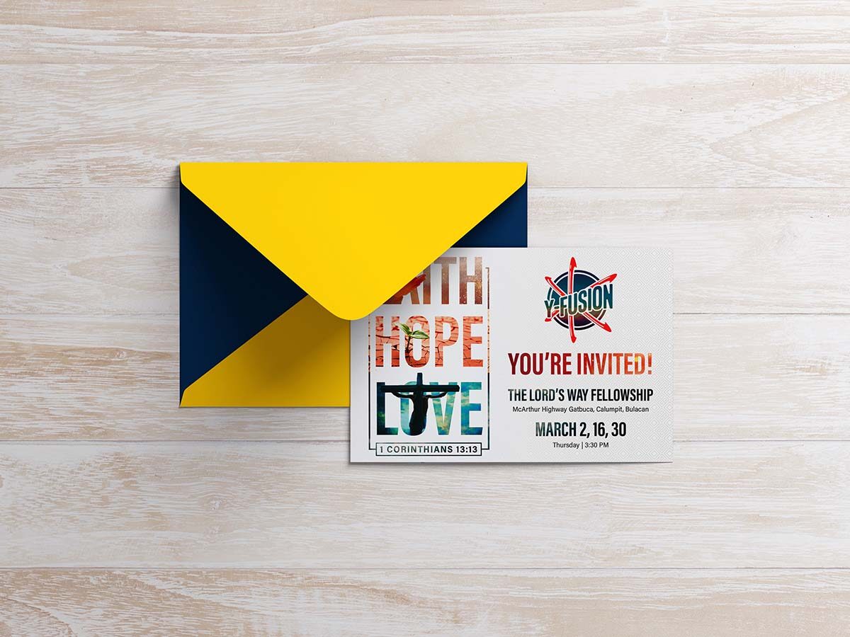
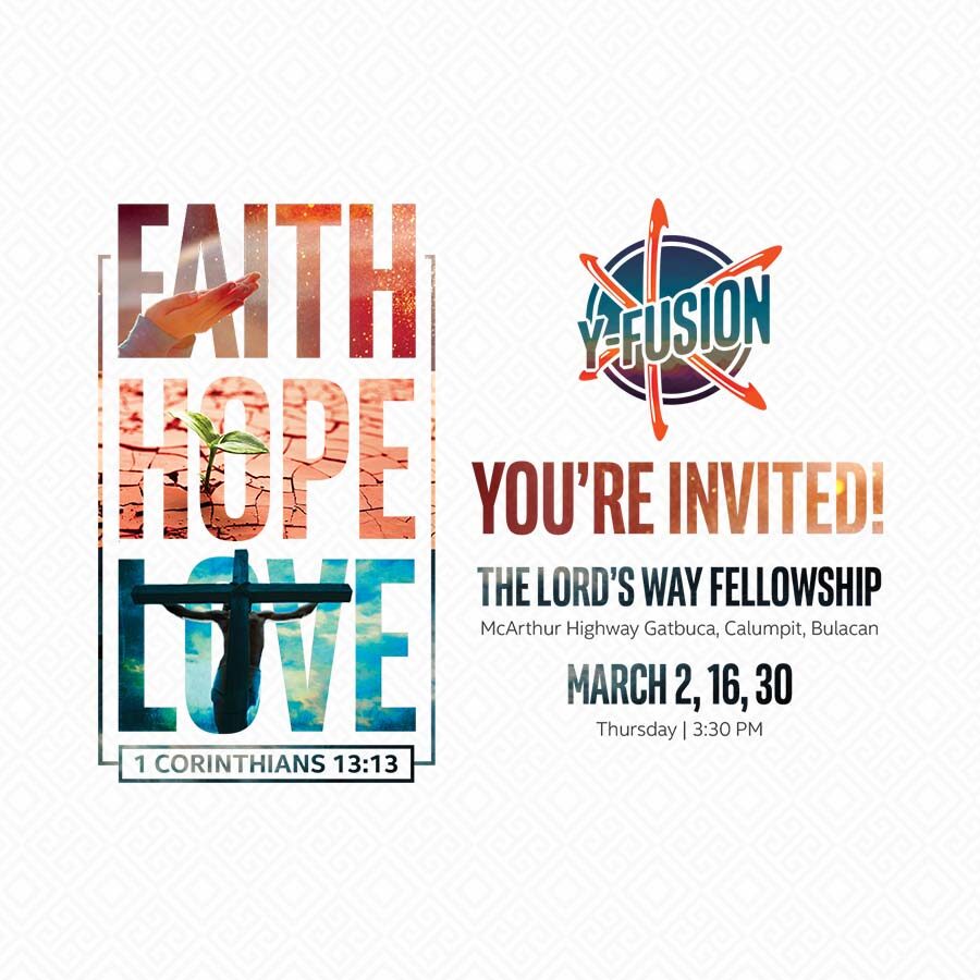
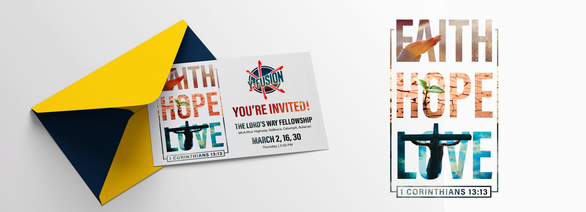
I utilized a type-driven collage approach, where each word served as a transparent window to a corresponding powerful image: a hand reaching out for Faith, a struggling sprout in cracked earth for Hope, and a stark, backlit cross for Love. This use of rich, relevant photography within bold, vertical typography created immediate visual interest. The colors (Red, Orange, Blue-Green) were chosen to establish a distinct, energetic visual separation while the overall layout was optimized for integration alongside the event’s existing branding (Y-Fusion logo) on the postcard format.
Results
The campaign’s success was evident in the resulting engagement metrics. The vibrant, thematic design helped drive a measured increase in event attendance by 30% over the previous quarter’s average youth gathering, indicating strong resonance with the target demographic. Furthermore, the design proved highly shareable; the corresponding digital asset achieved an organic social media reach 65% higher than standard event announcements, demonstrating the efficacy of conceptual, high-impact visuals in driving grassroots promotion.
Let's work together
Let's work together
Let's work together
Let's work together
Let's work together
Let's work together
Let's work together
Let's work together
Let's work together
Let's work together
Let's work together
Let's work together
Let's work together
Let's work together
Let's work together
Let's work together
Let's work together
Let's work together
Let's work together
Let's work together
Let's work together
Let's work together
Let's work together
Let's work together
Let's work together
Got something in mind?
Let’s build something remarkable together. Drop me a message and let’s chat.